Every spring, a refreshing spectrum of colours bursts forth from the latest showcases at fashion and design weeks. Take a look at this season's most popular shades:
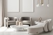
Hot pink
Hot pink is a standout accent colour, as seen in a vibrant Aspen, Colorado home designed by Patrick Mele. According to Gemma Riberti, director of interiors at WSGN, the hot pink trend, initially popularised by Barbiecore, remains strong.
Butter yellow
Interior designer Shea McGee introduces butter yellow as a trendy colour, highlighting its optimistic charm.
Photo: Dreamstime.com
Radiant red
Red is another prominent colour this season, used in both apparel and interiors. Riberti mentions that the hue had a viral moment on TikTok, with the 'unexpected red theory' suggesting that adding a red element can enhance any space. This classic yet playful shade complements colours like green, orange, and violet, ensuring its continued relevance.
Earthy browns
Designer Mike Moser's Los Angeles home features a rich chocolate hue called Best Bronze by Sherwin-Williams. Riberti explains that in uncertain times, grounding colours like greens and browns become popular.
Terra-cotta
Terra-cotta hues, reminiscent of desert landscapes, are also popular this spring. Interior designer Kate Marker notes that terra-cotta provides a rich, earthy feel, suitable for living rooms and outdoor spaces.
Rich greens
Deep, rich greens are making a significant impact. Riberti points out that green, like brown, is a grounding colour but with more vibrancy.
Source: www.aol.com